From Question to Chart Without the Middle Step
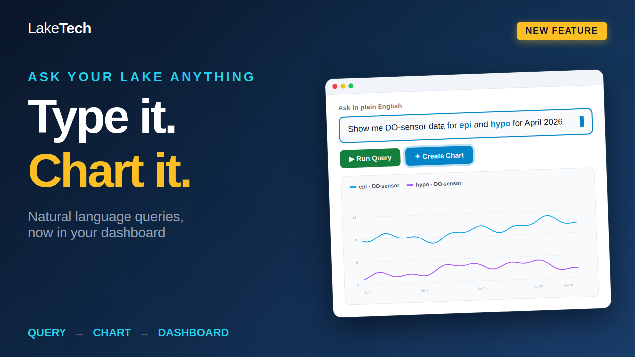
Most lake managers we talk to already know what they want to see. The problem has always been getting there. Pulling dissolved oxygen profiles for a specific window, filtering by depth layer, or comparing epilimnion and hypolimnion conditions used to mean exporting CSVs, building a pivot, and hoping you remembered which sensor was at which depth. For people running a lake instead of running a database, that workflow ate hours every week. The new natural language query feature in your LakeTech dashboard removes that gap entirely. Type what you want the same way you would ask a colleague, and the platform returns the matching data. Then with two clicks, that data becomes a chart on your personal workspace, ready to refine or publish. We built this because our customers are biologists, lake managers, and HOA board members, not SQL writers. Your time should go toward interpreting the lake, not wrestling with the tool that monitors it.
- No query language required, just plain English
- Works with every sensor type already feeding your LakeTech account
- Two clicks from query result to a finished chart
- Personal dashboard for refinement before anything goes live
A Real Example: Dissolved Oxygen Across the Thermocline
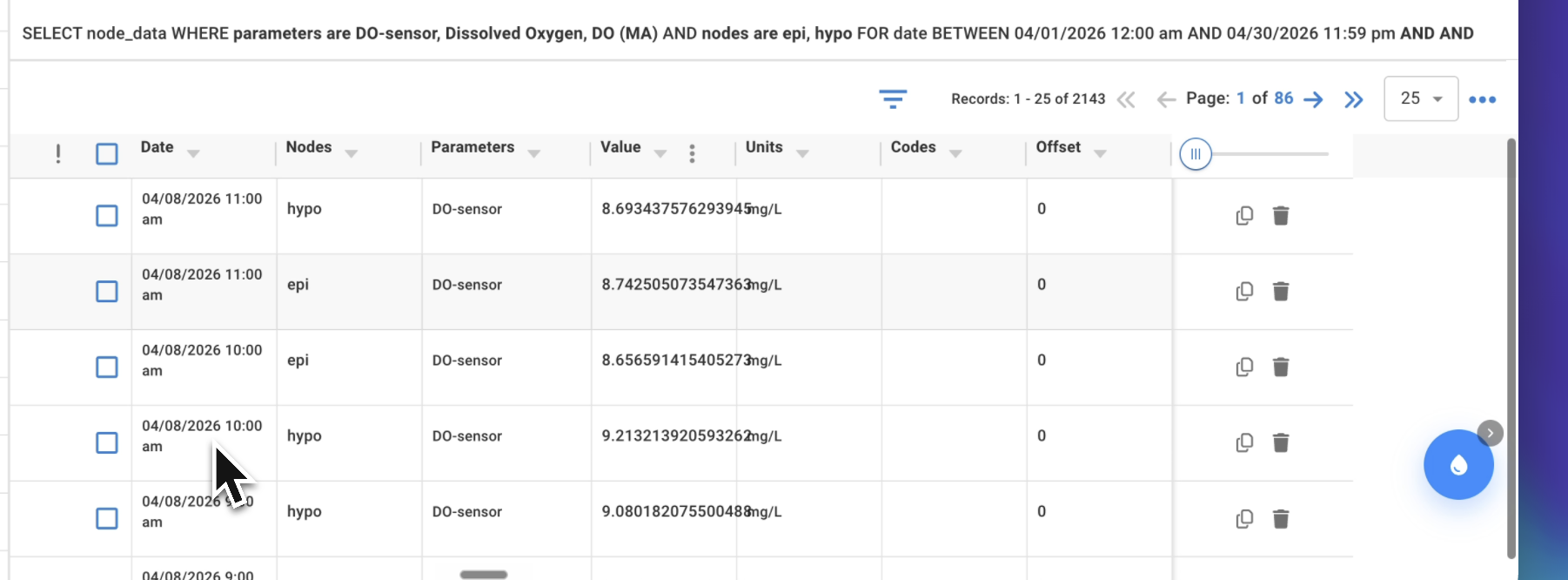
Here is the kind of question we hear constantly during stratification season. A manager wants to see how dissolved oxygen behaved at the surface compared to the bottom over a recent month. In the companion walkthrough video, a user types: "show me DO-sensor data for epi and hypo for April 2026." The platform recognizes the sensor type, the depth zones, and the date range, then pulls the matching readings from the relevant buoys. What used to take a CSV export, a filter pass, and a manual chart now happens in one prompt. The system understands shorthand the way a limnologist would. Epi means epilimnion, hypo means hypolimnion, DO means dissolved oxygen. You can phrase it loosely or precisely and the result is the same. This matters most during the spring transition into summer stratification, when the gap between surface and bottom oxygen widens quickly. Catching that divergence early is the difference between a planned aeration response and a fish kill phone call at six in the morning.
- Recognizes common limnological shorthand (epi, hypo, DO, temp, pH, ORP)
- Parses date ranges in natural form ("April 2026", "last 30 days", "this season")
- Filters by depth layer, sensor ID, parameter, or a combination
- Returns a clean data preview before you commit to a chart
Two Clicks to a Chart on Your Personal Dashboard
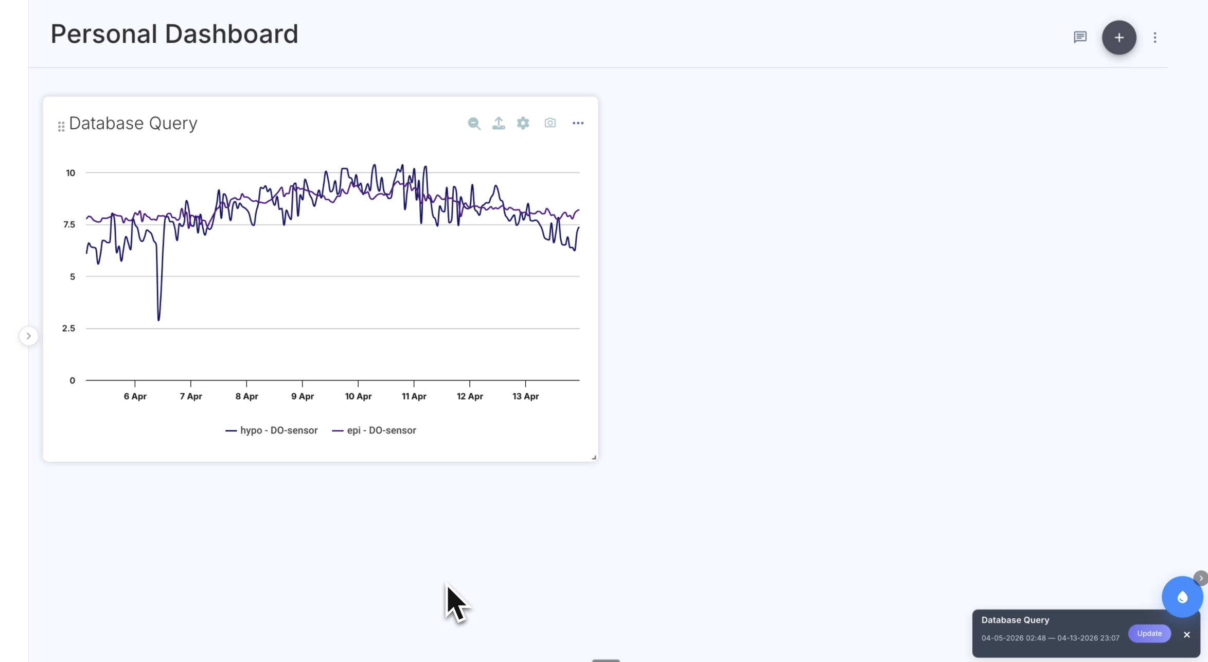
Once the data lands, you click "Create Chart." The platform picks a sensible default based on the parameter and the time range, typically a time-series line chart for continuous data or a comparison plot when you have queried multiple zones. The chart drops directly onto your personal dashboard, which is your private workspace inside the LakeTech environment. Your personal dashboard is where iteration happens. Change the chart type, adjust the axis range, swap colors, rename the series, or layer in a second parameter for context. Nothing here is visible to your team or your stakeholders yet. It is your space to get the visual right before it goes anywhere else. This separation between drafting and publishing is intentional. Lake data tells a story, and the story changes depending on what you choose to show. Refining in private means the version that reaches your board or your residents is the version you actually meant to share.
- Chart renders directly into your personal dashboard, not a public view
- Edit chart type, axes, time range, color, and labels
- Layer multiple parameters on a single chart for context
- Save drafts indefinitely until you are ready to publish
Publishing to the Master Dashboard or a Public Portal
When a chart is ready, you decide where it goes. Push it to your master dashboard and it becomes part of your team's shared operational view, alongside the other charts your colleagues rely on. Push it to a public portal and it becomes visible to whoever you have given that link to, whether that is an HOA membership, a city council, a regulatory contact, or a research partner. Public portals are particularly useful for HOAs and water districts who want to show residents what the lake is actually doing. Instead of fielding the same questions every summer about water clarity or oxygen levels, you point people to a live chart that updates as the sensors report. Trust goes up, repetitive emails go down. You retain full control over what is published and what stays internal. Charts on the master dashboard can be edited or pulled at any time. Public portals can be turned off or rescoped on demand.
- Master dashboard for shared team and operations views
- Public portals for HOAs, residents, regulators, and research partners
- Granular control over what is visible at each level
- Charts continue to update automatically as new sensor data arrives
What This Changes for Lake Managers
The shortest version of this update is that the time between having a question and having an answer just collapsed. A board member asks how DO looked through the spring transition. You type the question, get the data, build the chart, and have the answer in front of them before the meeting moves on. No export, no spreadsheet, no asking the vendor to pull a report. Over the longer term, this changes how we think about lake monitoring data itself. When the tool to interrogate the data is this fast, you ask more questions. You compare more years. You catch trends earlier. The data starts working for you instead of sitting in a database waiting for someone to come ask the right way. We will keep expanding what the natural language layer understands, including more parameters, more derived metrics, and more comparison patterns. If there is a question you wish you could ask your data, tell us. The next release is shaped by what our users actually need to know.
- Faster path from question to answer for managers and boards
- Encourages deeper, more frequent use of monitoring data
- Reduces dependence on technical staff or vendor reports
- Roadmap is shaped by user requests for new query patterns