
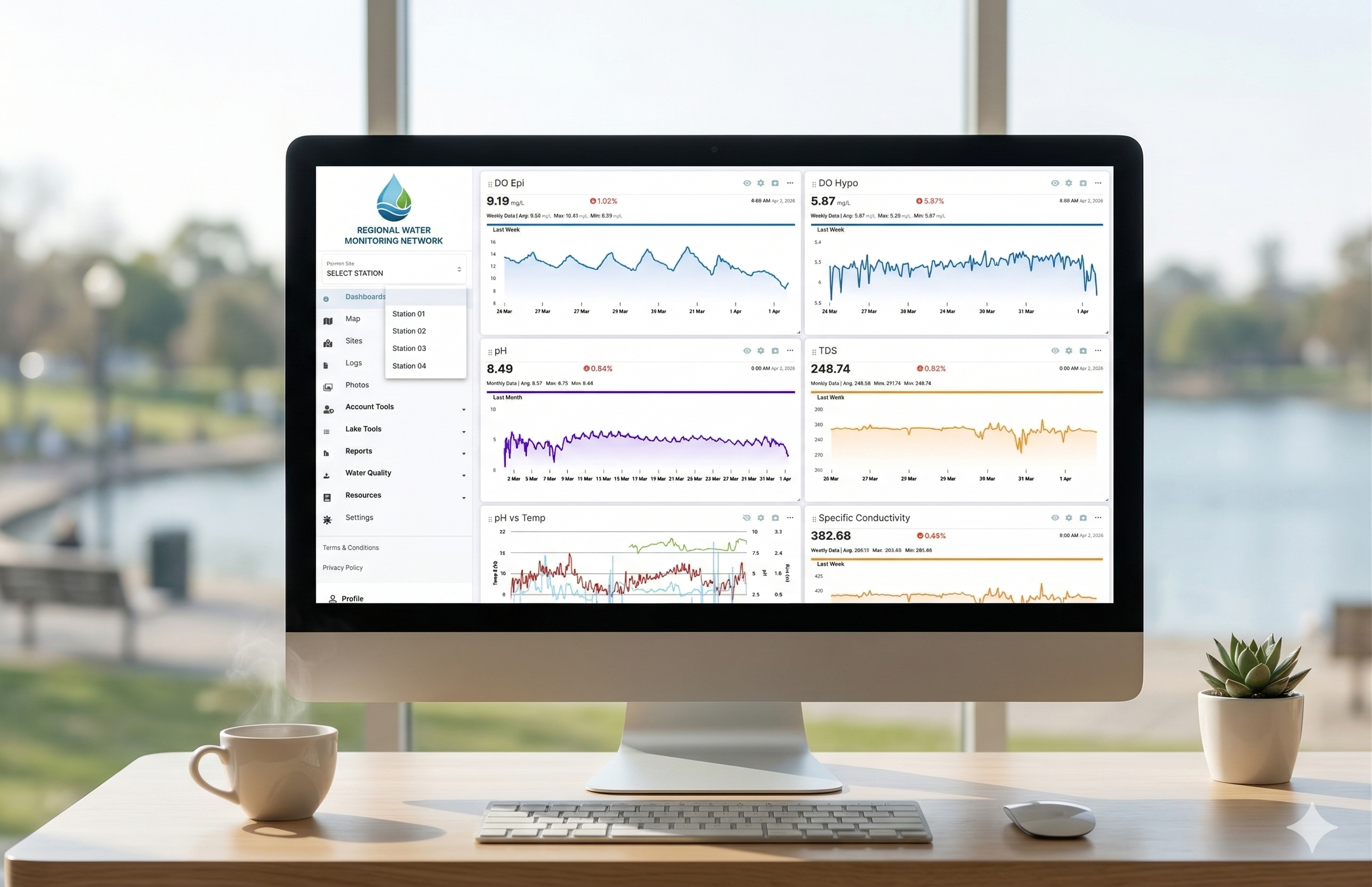
September 2024 widget announcement
According to the source article published September 25, 2024, LakeTech introduced a dynamic visualization widget that showcases daily fluctuations in water quality parameters, such as dissolved oxygen, by displaying the percentage of time spent in user-defined concentration ranges.
The source article describes the tool as a way to monitor and manage lake health with a clear, visual summary of parameter behavior.
A deeper dive into the widget
The source article states that the widget uses a stacked bar chart format where each bar represents a 24-hour period divided into red, yellow, and green segments corresponding to concentration ranges set by the user.
By customizing concentration ranges, users can tailor the widget to the parameters most critical to their lake management needs.
- Green zone: optimal conditions where parameter levels are within the desired range.
- Yellow zone: cautionary levels indicating the parameter is approaching critical thresholds.
- Red zone: alert levels where immediate action may be required.
Why the source article highlights this widget
The source article states that understanding daily fluctuations in water quality parameters is crucial for maintaining a healthy aquatic ecosystem because parameters such as dissolved oxygen can significantly impact fish health and algae growth.
The widget is described as providing insights that help users spot trends, make informed decisions, and allocate resources more effectively.
Equipment performance monitoring
According to the source article, the widget can help evaluate installed aerators, fountains, or other oxygenation equipment by visualizing how equipment affects dissolved oxygen levels throughout the day.
The article states users can determine optimal operating times, quickly identify equipment malfunctions when expected improvements are not observed, and adjust operations based on the visualized data.
Treatment efficacy evaluation

For chemical or biological treatments aimed at controlling algae, weeds, or other issues, the source article states the widget can help users track how treatments influence water quality parameters over time.
The article describes using the visualization to measure the percentage of time the lake remains in optimal conditions post-treatment and to plan follow-up treatments or dosage adjustments.
Customization for your needs
The source article states that users can select parameters such as dissolved oxygen, pH, turbidity, or temperature and define red, yellow, and green thresholds based on their lake's ecology.
Users can also compare data across days, weeks, or months to understand longer-term trends.
How to get started (as described in the source article)
The source article outlines these setup steps within the LakeTech platform at the time of publication.
- Access the dashboard: log in to your LakeTech account and navigate to the widgets tools section.
- Configure settings: select the Daily Bar Widget and set concentration ranges.
- Customize visualization: choose color codes and time frames that suit monitoring needs.
- Start monitoring: view stacked bar charts and analyze data for actionable insights.
Source article closing notes
The source article states that LakeTech's support team was available to help configure the widget and that the visualization was presented as one way the company was advancing lake management through technology.
Forward-looking statements in the source article, including references to revolutionizing lake management strategy and upcoming features, reflect editorial marketing copy from September 2024 and need verification against the current platform.